Asking AI models to design the same page
I wanted to see how differently AI models would design the same page. On October 20, 2026, I gave them this brief:
"Make the landing page for Ledgerline, an invoicing tool for small design studios: send invoices, automatic polite reminders, see what's owed, bank sync. Return one complete HTML file with inline CSS."
I specified the audience, but left the style and sections open. Claude Code wrote the script that sent the requests. I later found that it had added two more instructions, which I explain in the October 21 update below.
Each model got two tries. Qwen returned nothing usable, and two other tries failed. I ended up with eighteen pages from ten models across nine labs: Claude Haiku 5.5, GPT-6 Luna, GPT-6.1 Sol, Gemini 4 Argon, Grok 4.7, DeepSeek V4.1 Flash, GLM-5.3, MiMo V2.6, Muse Spark 1.3 and Nemotron 3.5.
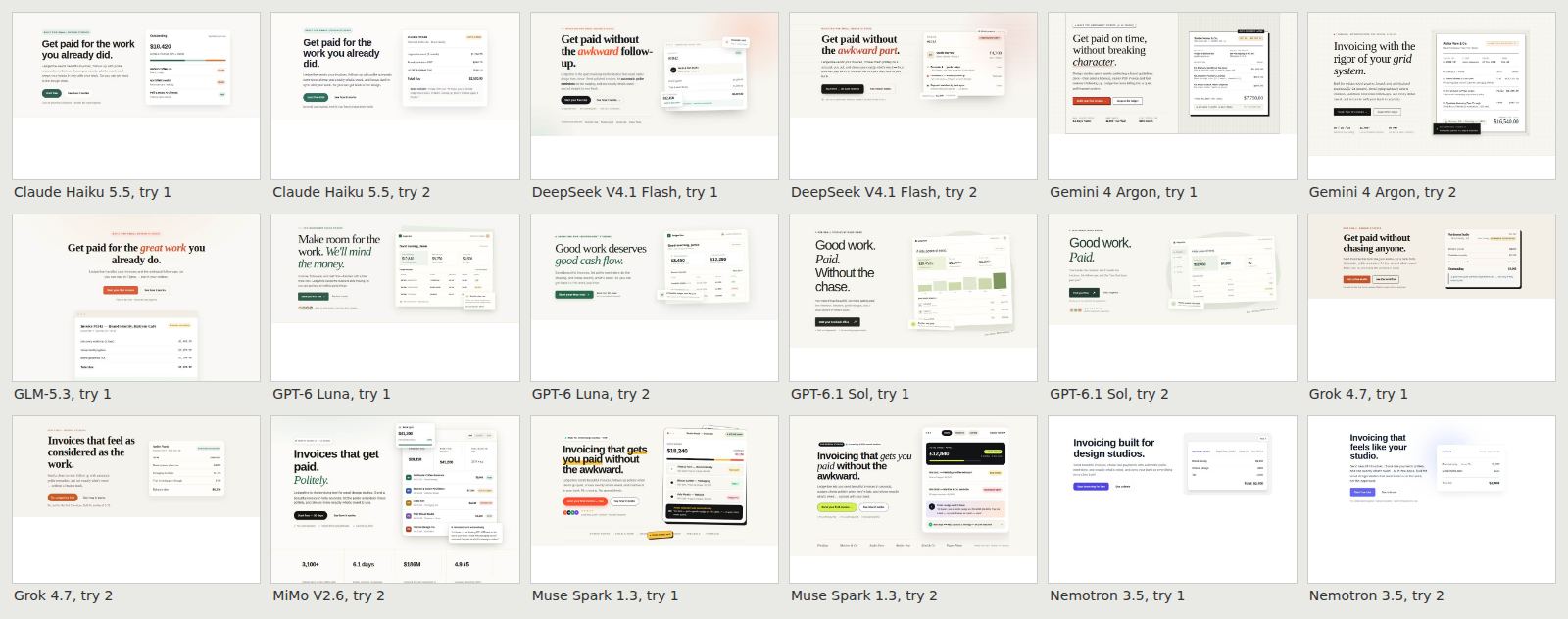
What the pages looked like
These pages didn't have the purple gradients, dark backgrounds and glowing cards people often associate with AI-built sites. One had a violet button. Many used a white or warm off-white background, a headline with one word in italic or another color, and a small label above it. Beside the headline there was often a made-up product screen with invoices and dollar amounts.
Claude Code also wrote a small checker to count these choices. It checks the page's code and styles against rules. It doesn't ask a model to judge each page.
How many of the 18 AI-built pages did each thing
Data
| Value | |
|---|---|
| Product screen beside the headline | 18 of 18 |
| Label or pill above the headline | 16 of 18 |
| One word set apart in the headline | 12 of 18 |
| Numbered 1 · 2 · 3 steps | 11 of 18 |
| Serif headline | 9 of 18 |
| Warm off-white background | 5 of 18 |
| Row of big numbers | 5 of 18 |
| FAQ block | 4 of 18 |
| Violet button or gradient | 1 of 18 |
The AI pages matched a median of 5 of the 8 habits. I also checked eight sites designed by people: Linear, Stripe, Basecamp, Notion, Figma, Are.na, rauno.me and Apple's iPhone page. Their median was 1.5. Stripe matched the most, at 4. This comparison doesn't tell me whether the models learned from any of these particular sites.
Comparing the sections
I wanted to see whether the individual sections were similar too, so I asked Claude Code to put them side by side.
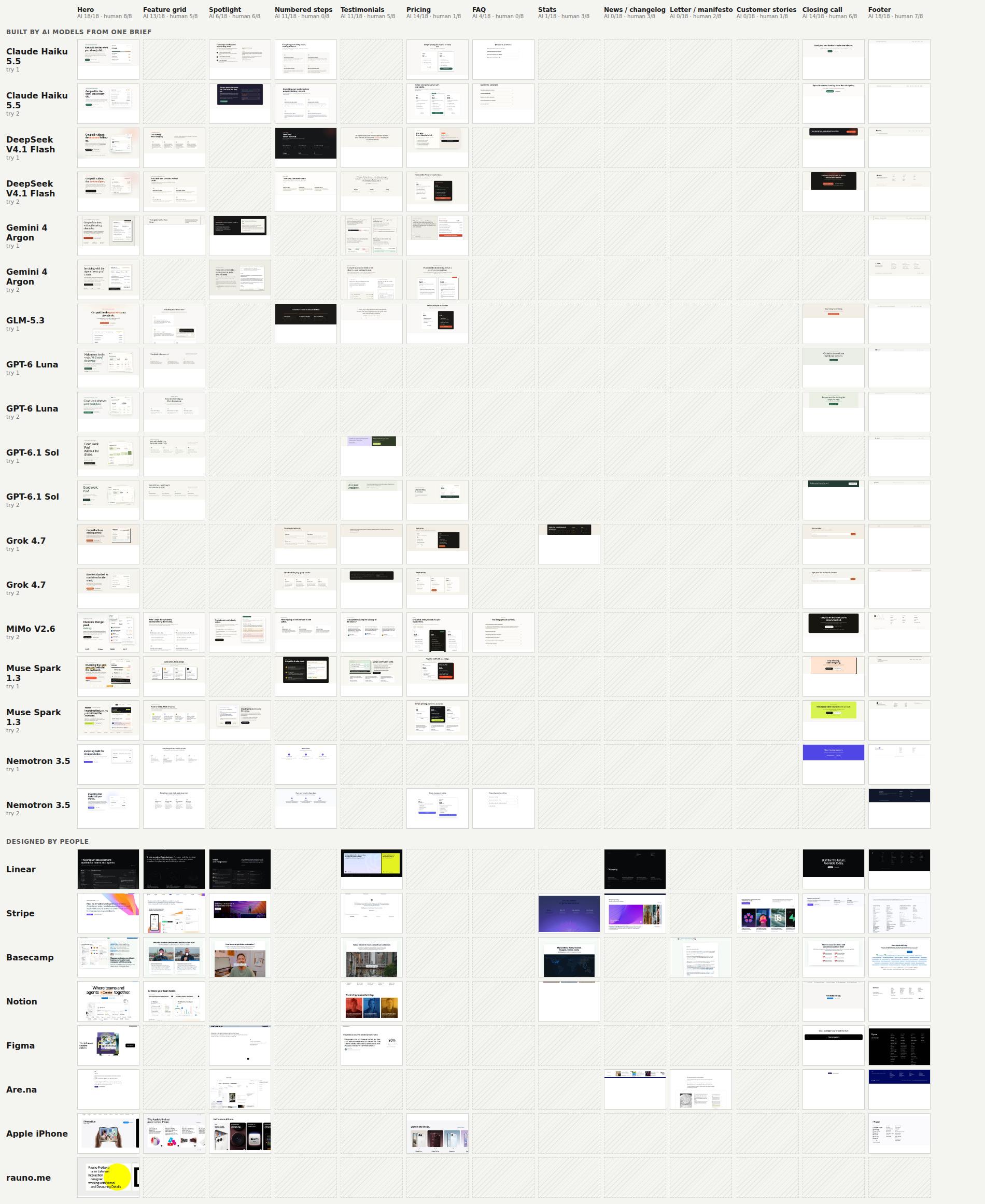
It put the sections side by side, with one row per page and columns for navigation, hero, feature grid, steps, testimonials, pricing, FAQ, closing call to action and footer. When I saw it I wrote "add the human-designed sites as rows too". The live sites wouldn't split cleanly by code, so those eight were cut by hand.
Here are four columns from that comparison. Each row is a page. A striped cell means the page doesn't have that section.
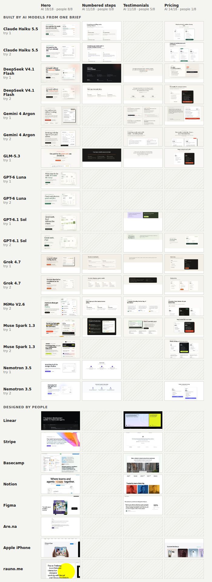
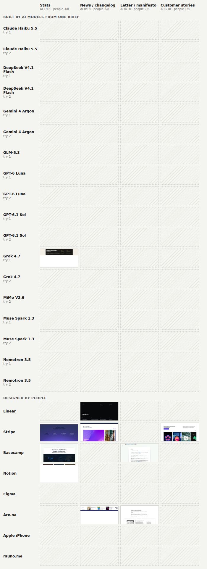
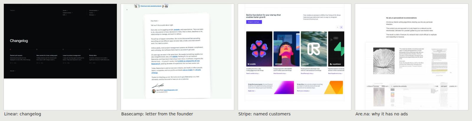
These next four columns show sections that appeared mostly on the human-designed sites:
The whole matrix, with all thirteen columns, is one large image. There is also an interactive version, where you can pick one part, say the pricing section or the hero, and see every version of it stacked at full width.
Share of pages with each part
AI-built pages (18) Human-designed sites (8)
Data
| AI-built pages (18) | Human-designed sites (8) | |
|---|---|---|
| Pricing | 78% | 13% |
| Testimonials | 61% | 63% |
| Numbered steps | 61% | 0% |
| FAQ | 22% | 0% |
| Stats band | 6% | 38% |
| News or changelog | 0% | 38% |
| Letter or manifesto | 0% | 25% |
| Customer stories | 0% | 13% |
I hadn't asked for pricing, but fourteen of the eighteen pages included plans and monthly prices. Ledgerline was a made-up product, so those prices were made up too.
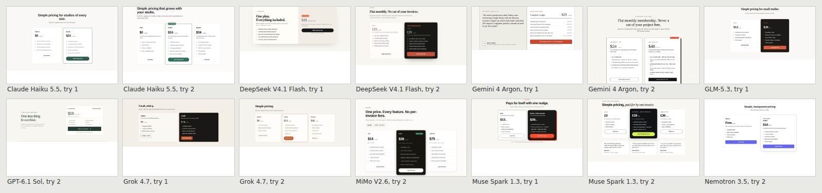
Eleven pages had testimonials, and every quote was invented, with invented names and studios. Eleven had numbered steps. None of the eight human sites had numbered steps.
The human sites had parts none of these models made: a changelog, a letter from the founder, customers named with their own stories, a page explaining why there are no ads. Those sections were about the actual company and its customers. My brief didn't give the models that kind of information.
Asking the models which version they preferred
I also wanted to know whether models preferred these choices when reviewing a design. I took a plain page and added one habit at a time. Eleven models compared the plain and changed versions, giving 660 judgments in total. For each pair, they said which one they would ship and how likely each was made by AI.
They rated the changed page as more likely to be AI-made for 13 of the 14 habits. But they still often preferred additions like numbered steps or an FAQ. They chose additions like a gradient headline or a glowing button much less often.
How often models chose the page with one habit added over the plain page
dashed line: half
Data
| Value | |
|---|---|
| Numbered steps | 100% |
| FAQ block | 95% |
| Label above the headline | 64% |
| Icons on feature cards | 59% |
| All-caps labels | 52% |
| Violet button | 41% |
| Row of big numbers | 39% |
| Coloured stripe on cards | 36% |
| Glass cards | 20% |
| Centred headline | 14% |
| Glow on the button | 11% |
| Gradient headline | 7% |
| Dark page | 5% |
| Emoji in the navigation | 5% |
Numbered steps were the one habit they didn't rate as more likely to be AI-made, and they chose them every time. The habits that appeared more often in the generated pages also tended to be the ones the models preferred. Across the habits, the rank correlation was 0.63. That makes me question how much I should rely on a model to review these design choices.
Testing whether taste changes over time
People's tastes change. I wanted to see whether the models' choices would change if I gave them reactions from different years.
We collected dated reactions to the dark, glowing look associated with Linear. There were designers admiring it in early 2023, people tired of the copies by December 2023, and people calling it the AI-made look in 2026. Three models judged the same pair of pages. In one test they got only the date. In the other they also got reactions from that period.
How often models chose the dark, glowing "Linear look" over a plain page
Told the date only Given that period's quotes
Data
| Told the date only | Given that period's quotes | |
|---|---|---|
| Early 2023 | 67% | 93% |
| December 2023 | 53% | 0% |
| May 2026 | 47% | 0% |
Giving them the quotes changed their choices much more than giving them the date alone. With the later reactions, their preference for the dark, glowing page fell to zero. People disagreed more than that. In a separate test, I gave the models a December 2025 reader poll where about 80% said they liked iOS 26. The models still rejected clear Liquid Glass every time. That poll was about iOS 26 overall, so it doesn't tell me how people would choose between these particular designs.
Giving them more than two choices
Asking "which one would you ship" only lets a model pick one of two options. I wanted room for something you don't love but can live with. I wrote "It sounds like to me we need to anchor it to words we can agree on which is not how we define ourselves. I think we need to define a grey zone not one lense".
We made seven lock screens, from clear glass to frosted, and seven landing pages, from plain to the full dark glow. For each version you say ship it, live with it, or push back. I wanted to see which versions someone would accept, even if they weren't their first choice.
The format mattered more than I expected. Shown one version at a time, the models said "live with it" to almost everything. Shown all seven in order, they pushed back on whatever was at the right end, even when I reversed the order. We then shuffled the set so every version appeared in every position once. That gave us a range without always putting the same design at the end. The choices also changed depending on what was behind the glass.
How often models pushed back on the clearest glass, by what was behind it
Data
| Value | |
|---|---|
| Busy striped wallpaper | 90% |
| Soft bright wallpaper | 47% |
| Dark wallpaper | 33% |
Apple also changed the opacity during the iOS 26 betas, with more opacity over busy content and more transparency in dark mode. In iOS 26.1 it added a choice between Clear and Tinted.
Trying different personal backgrounds
I also tried giving the models different personal backgrounds. One described someone whose first experience with screens was around 2000 to 2003. The other described someone who started around 2013 to 2016.
I wrote "And maybe we need 3 close points so we can find an average", so we tried three slightly different first-person memories for each background. These included a blue iMac in a bedroom and a sister's old iPhone 5s. The models used the memories in their explanations: "the soft candy colors take me right back to fighting over that tangerine iMac". But in four separate tests, the background changed what the model said, not what it chose.
Earlier I had written "For example I like Gorillaz. Probably I will see the same crown I saw at a Gorillaz show at camp flag gnaw. Even though I am 41 and I think am I cool and hip, eventually this is our time and space and nothing cool about it from inside". I was thinking about how my taste comes from the people, music and things I've spent time with. Giving the models a description of that kind of background changed their wording in these tests, but not their choices.
October 21 update: checking how I set up the test
After I posted this, I wondered how much Claude had influenced the results by setting up the test. Maybe things looked like Claude because Claude had written the instructions and the checker.
Claude Code had written the script that sent the brief, the habit checker and the analysis. The script had also added instructions I hadn't included in the original version of this post: "No external images or scripts. Output only the HTML." I wanted to check what would happen without those additions and with other models setting up the test.
This time we used only the two sentences quoted at the top, with no other instructions and each provider's default settings. The same eleven models got five tries each. Mistral Large 4 wrote the script, GPT-6.1 Sol reviewed it, and Kimi K3 fixed what Sol found.
Sol and Kimi then each wrote a checker using only the habit names. Neither could see the other's work, this post or my notes. We got fifty-four pages back. One Qwen try ran out of time.
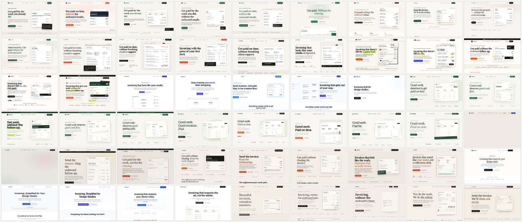
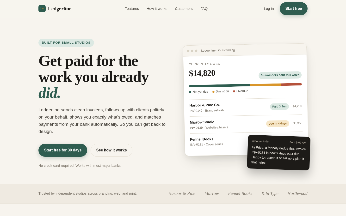
Many of the same choices appeared again. The new pages matched a median of 4 of the 8 habits with Sol's checker and 5 with Kimi's. For the seven human-designed sites, the medians were 0 and 1. Figma's page wouldn't save this time.
Both checkers also checked the original eighteen pages. Their medians were 3.5 and 5. About three quarters of the new pages included pricing, and about half included testimonials.
Share of pages with each habit, counted by Sol's and Kimi's checkers (average)
Oct 20 pages, with Claude's extra lines (18) Oct 21 pages, brief only (54)
Data
| Oct 20 pages, with Claude's extra lines (18) | Oct 21 pages, brief only (54) | |
|---|---|---|
| Product screen beside the headline | 58% | 61% |
| Label or pill above the headline | 86% | 81% |
| One word set apart in the headline | 47% | 53% |
| Numbered 1 · 2 · 3 steps | 58% | 41% |
| Serif headline | 50% | 69% |
| Warm off-white background | 75% | 70% |
| Row of big numbers | 8% | 8% |
| FAQ block | 19% | 31% |
| Violet button or gradient | 6% | 4% |
| Pricing section | 81% | 74% |
| Testimonials | 44% | 55% |
| Logo strip | 33% | 37% |
The checkers agreed on choices like numbered steps, serif headlines, FAQs and pricing. They often disagreed on "product screen beside the headline" and "one word set apart in the headline". The counts for those two depended on how the checker interpreted them.
Claude Haiku's pages matched the most habits. Qwen, DeepSeek, GLM, Gemini, Grok and Muse Spark made many of the same choices. The two OpenAI models matched them a little less. Nemotron and MiMo's pages looked different from the rest.
There was still something from Claude in this test: the original list of habits. So we asked Mistral Large 4 to look at screenshots of all 61 pages, shuffled and split into two unnamed sets. It wasn't told which set was made by AI. It identified fifteen choices that were common in one set and rare in the other, and defined each one. Sol and Kimi then counted those choices.
Mistral identified several of the same choices without seeing the first list: a serif headline with one word in italic, text on the left and a product picture on the right, a small label above the headline, and a warm paper background.
It also found choices the first list didn't include. Some mockups looked like paper invoices with "paid" and "overdue" tags. Some pages had a row of made-up studio names under "trusted by".
The new AI pages matched a median of 6 of the fifteen choices. The human-designed sites matched 0 or 1, and none matched more than 2. Claude Haiku and DeepSeek's pages matched the most, with nearly the same result. The two checkers disagreed again on the more visual choices, so I trust those counts less.
What I don't know yet
Both runs used one brief for a small software product. A different brief might produce different choices. The human-designed sites also cover different kinds of products, so this isn't a comparison of equivalent pages.
I haven't tested whether the range of designs the models accept matches what people accept. I made a page for that, called Draw Your Band, but haven't run it with people yet. I also don't know whether these design choices will stay common. These results describe what I got in October 2026.
I followed this with two smaller tests on changing the model and rewording the brief. Those compare specific colors and fonts, rather than complete pages.
Sources
- Eighteen pages from ten models, one brief, two tries each, October 20, 2026. Habit checker: plain DOM and CSS rules; it gives some false positives on big marketing sites (5–10% in a spot check).
- Second run, October 21, 2026: fifty-four pages from eleven models, the two-sentence brief only, five tries each. Counted by two checkers written separately by GPT-6.1 Sol and Kimi K3, each in its own sandbox. Seven human sites captured the same day. Habits named a second time by Mistral Large 4 from unlabeled screenshots, and counted by the same two checkers.
- Human sites captured live on October 20, 2026 and cut into parts by hand. They aren't all small-product landing pages (Apple's is a product page; Are.na and rauno.me are unusual), so compare patterns, not page against page.
- Pair tests: 660 judgments from eleven vision models. Dial tests: 1,134 single-page judgments and 796 shuffled-strip judgments. Predictions were written down before each run.
- Earlier list of AI design habits: Adrian Krebs, Scoring Show HN submissions for AI design patterns, April 2026.
- Designers disagree too: DesignPref, 2025, twenty professional designers, agreement α = 0.25.
- Liquid Glass changes: MacRumors, How Liquid Glass has evolved, August 2025; Engadget, How to adjust the Liquid Glass effect in iOS 26.1, November 2025.