Making Verity and Hormuz Open
In March 2026 I started a map in Replit. The first feature, on the night of March 13, was a heat map of NASA fire data, which is why the app is still called Fire Monitor. By March 15, with news and Telegram layers added, it was called Verity: a dark world map with clustered events, a threat index in the header and a 24-hour timeline along the bottom.
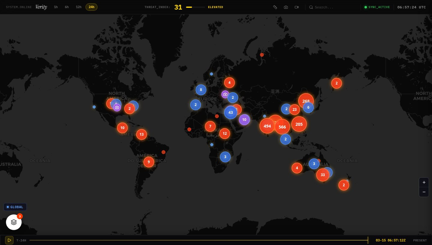
I built it by writing briefs with a chat assistant and pasting them into Replit Agent. They read like design specs, with type choices and acceptance criteria like "Timeline scrubbing must feel like 'scrubbing a video,' not loading a webpage."
On March 16 I wanted to add a radio station to the map. That day's brief asked for "a true 24/7 continuous audio radio station" that "must never have silence or gaps." Two hosts, Alex and Maya, would discuss the live data, with Claude writing each segment and Google text-to-speech reading it while the next one was generated. The planning notes I pasted chose Claude as the writer: "Claude does narrative arc, tension, and character-driven storytelling much better."
By July it didn't sound right. On July 8 I typed: "how do i improve the podcast quality. it is very repeatteive and ai fake." The Claude Code session found several causes. One was about the format itself: the two-anchor setup "is itself the NotebookLM-podcast cliché. It reads as 'AI podcast' before a word is judged." My own brief had asked for that format. It also found that Maya's scripted catchphrases used "it's not just X, it's Y", so the prompt was teaching the hosts one of the patterns that make text sound like AI.
Then I asked "why dont we use grok for writing adn gemini for critique with cross model?" It ran a bake-off instead: the same prompt to several writers, each script scored by a model from a different company. Grok's hosts sounded as distinct as Claude's, but its grounding scored lowest. The critic wrote "over-reliance on implausibly specific, likely invented data". In this small test, the most lively writer was also the one most willing to make things up. I wrote "ik lets go with claude + geminie combo", so Claude writes and Gemini checks each segment.
Hormuz Open
Hormuz Open grew out of the map on April 8 and 9. The first brief, pasted late on April 8, said "NOT a dashboard. NOT a data viz. A photo essay meets a status page." One word, open, restricted or closed, over a photograph, because "The contrast between warm human photography and cold geopolitical status text is the emotional engine".
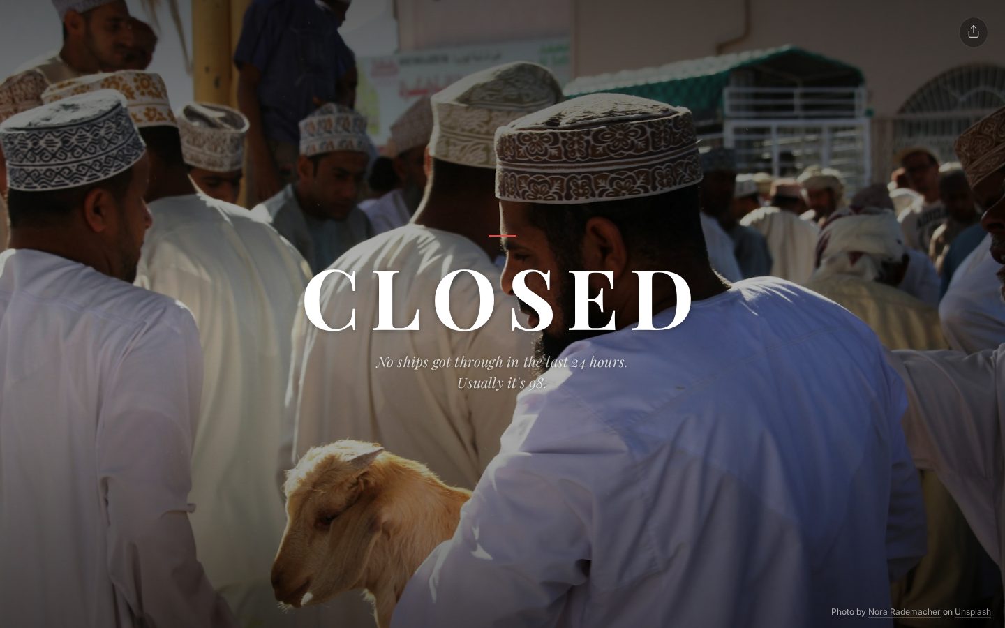
Most of that night was art direction. Half an hour after the first brief, another said the layout "looks like a postcard" and asked for the status word to "Scale to Breaking Point". The next morning a brief titled "Closer, Warmer, More Human" said "The people in photos are too far away. They're specks." It set a test for every photo: "Can I see a human or feel their presence?", "Is it warm?", "Does it make me feel something?"
I rewrote the brief for the dispatch several times. It is the few sentences Claude writes under the photo every four hours, and its brief was rewritten four times on the afternoon of April 9. First it was "too literary", more than 100 words about an invented neighbor. Then it was "too reporterly". The third rewrite changed the frame. The photos come from Unsplash, not from today, so a narrator describing the dock this morning was saying something false. The last brief marks that kind of line as bad: "BAD because photos are from the past, not live. Nobody is standing there now." The narrator became someone who "used to live near this water", with no names, no em dashes and "no poetic phrasing".
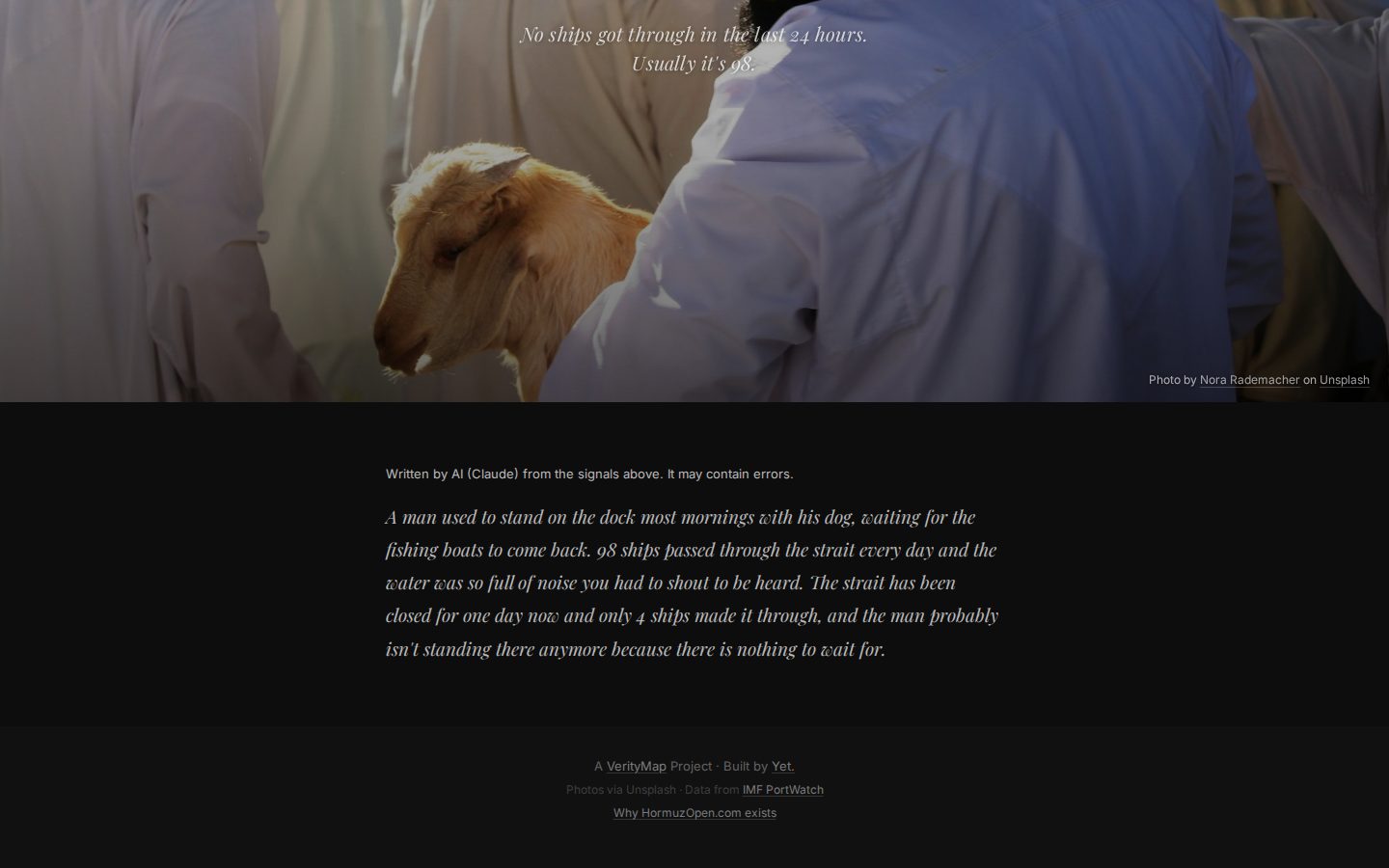
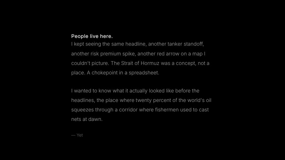
Behind the one word are four signals: ship crossings, the daily crossing counts from IMF PortWatch, news headlines and the oil price, combined into one score. The statement behind "Why this exists" changed too. In the brief it said "We wanted to make the strait feel close". On the site it is now in the first person, as on the project page.
Getting the writing right
In both projects Claude wrote fluent text from the start. I spent a lot of time deciding who the narrator was and what they could actually know. On the radio, the format I asked for made it sound fake. On Hormuz Open, the photos were old, so the narrator had to remember rather than watch. Lists of banned words helped, but the biggest changes came from fixing who was speaking. On Hormuz Open the page also says so: the dispatch is labelled as written by AI.
Sources
- Fire Monitor (Replit),
attached_assets/: "PROJECT: VERITY" brief (Mar 14, 2026), "Build Verity Radio" brief and pasted planning notes (Mar 16, 2026) - Fire-Monitor-ios, git history (Mar 13–14, 2026 first commits),
replit.md,artifacts/heat-map/public/terminal-preview.png - Claude Code session, Jul 8, 2026, Fire-Monitor-ios: my prompts, the diagnosis, the bake-off results
- Hormuz Open (Replit),
attached_assets/: "NEW PROJECT: hormuzopen.com" (Apr 8), "THE ARCHITECTURAL PIVOT" (Apr 8), "FIX: Art Direction" (Apr 9), "FIX: Dispatch Length" and three "UPDATE: Dispatch Voice" briefs (Apr 9), "FEATURE: Artist Vision Statement Overlay" (Apr 9) - hormuzopen.com, live site, Oct 19, 2026 (overlay screenshot)